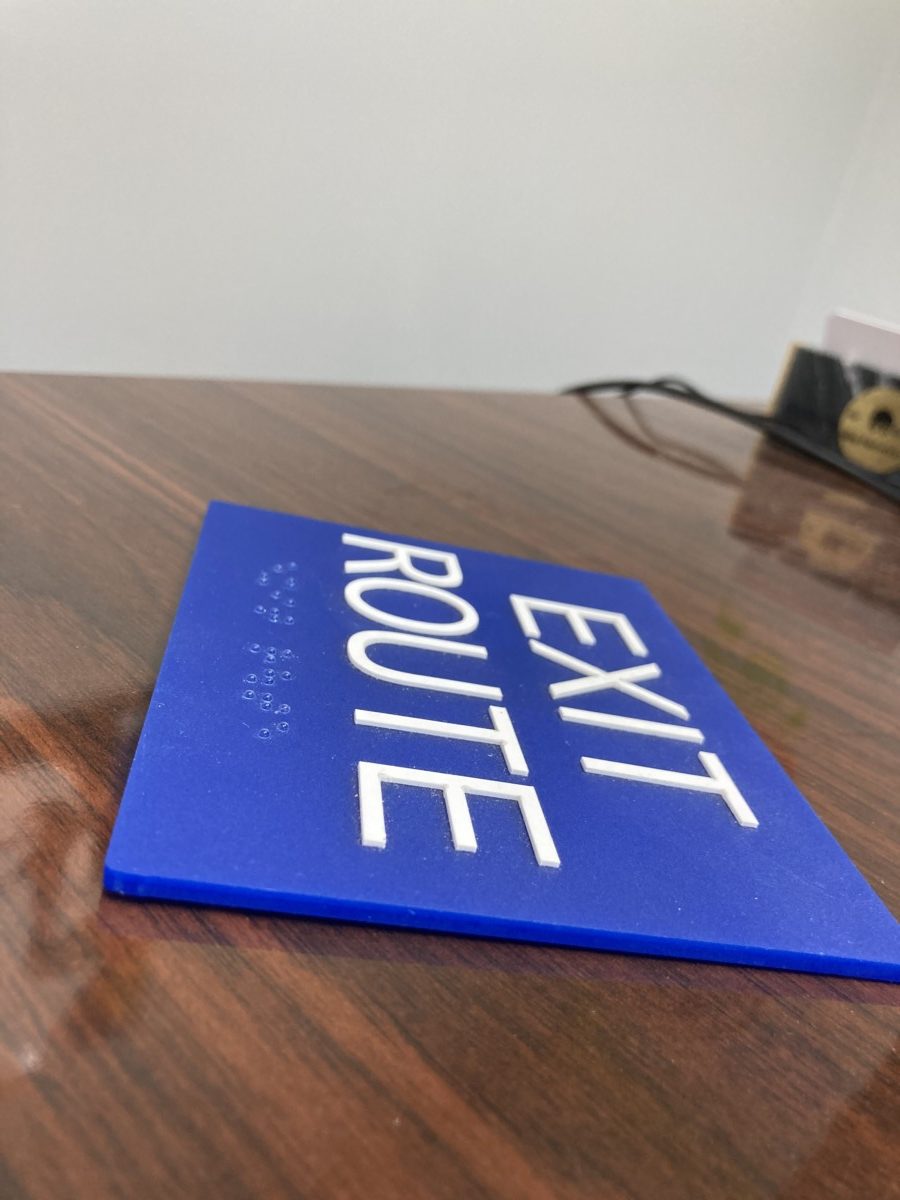
ADA signs are essential for ensuring accessibility and compliance with federal regulations. They provide crucial information to individuals with disabilities, helping them navigate your business safely and independently. ADA signs, however, don’t have to be boring or generic. By combining functionality with aesthetics, you can create ADA signage that enhance your brand identity and elevate your business’s overall appearance.
Ensuring Compliance with ADA Guidelines While Reflecting Your Brand Identity

When designing custom ADA signs, it’s essential to adhere to specific guidelines set forth by the Americans with Disabilities Act (ADA). These guidelines ensure that people with disabilities can easily read and understand the information provided. Here are some key considerations:
- Font and Symbol Size: Use clear, sans-serif fonts and symbols that are easy to read from a distance. The font size should be large enough to be easily visible, even from a distance.
- Color Contrast: Ensure sufficient contrast between the text and background to improve readability, especially for individuals with visual impairments.
- Braille: Incorporate Braille into your signs to provide information for visually impaired individuals.
- Tactile Symbols: Use tactile symbols to provide additional information for visually impaired individuals. These symbols can be raised or embossed to create a tactile experience.
While adhering to ADA guidelines is crucial, you can still infuse your brand’s unique personality into your signage. Consider the following design strategies:
- Color Palette: Choose colors that align with your brand identity and evoke the desired emotions.
- Typography: Select a font that complements your brand’s style and is easy to read.
- Material and Finish: Choose high-quality materials and finishes that reflect your brand’s image. For example, you might opt for a sleek, modern design with brushed aluminum or a more traditional look with wood accents.
Design Strategies for Creating ADA Signs that Enhance Your Interior Space
ADA signs don’t have to be an afterthought. They can be integrated into your interior design to create a cohesive and visually appealing space. Here are some design strategies to consider:
- Minimalist Design: A minimalist approach can create a clean and modern look. By using simple lines and neutral colors, you can create ADA signs that blend seamlessly into your interior design.
- Bold and Colorful: Use bold colors and eye-catching designs to make your ADA signs stand out. This can be especially effective in spaces with neutral color palettes.
- Subtle Integration: Incorporate these signs into your interior design by using matching materials and finishes. For example, you could use the same materials for your ADA signs as you do for your wall coverings or furniture.
Custom ADA signs can enhance your brand image, improve customer experience, and boost your business’s reputation. Contact Mercury Signs today to learn more about the benefits of custom ADA signage.

